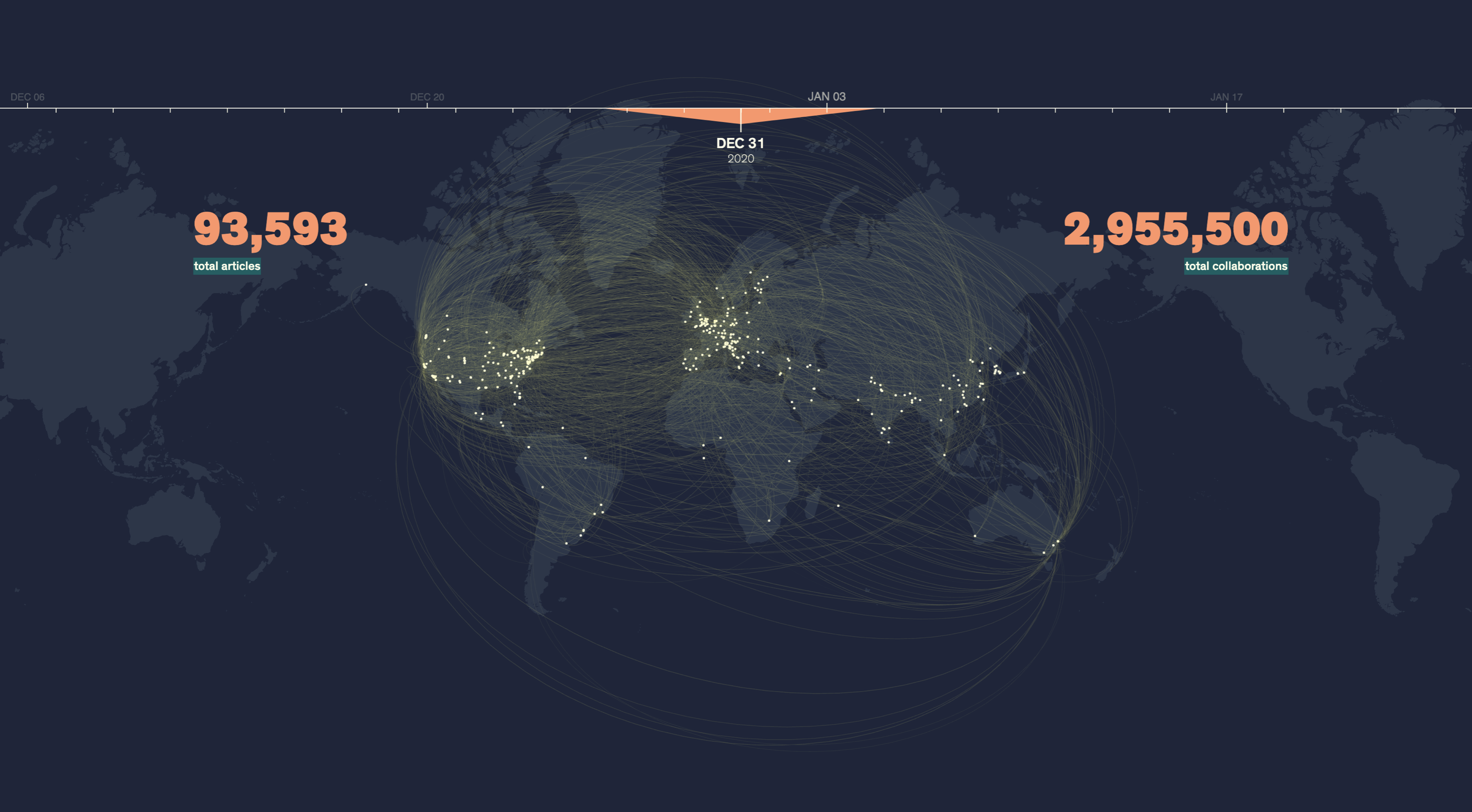
Following the Science is a data visualization project that celebrates the collaborative efforts of the global science community to help humankind understand and survive the pandemic. Created by Jeff MacInnes, a data scientist, visualization designer, and visual storyteller, his work shows the sheer scope of global scientific momentum that was generated by the onset of a virus. Assembling this massive picture turned out to be a labour of love for MacInnes, who traces it to his own roots in science.
“I did a PhD in cognitive neuroscience followed by a postdoc stint, during which time I found myself thinking a lot more about designing figures than, say, designing the next experiment,” he says. “I figured a career change was maybe a good move. But now that I’m doing data visualization and visual journalism full time, I jump at any project that’s a chance to dive back into the science and unite those two interests.”
He also points to the inspiring potential of information technology that can apply interactive visual storytelling techniques to break down complex and otherwise inaccessible science topics, making it possible to share them with wider audiences.
“This project started on a whim, wondering about how scientists were collaborating throughout the pandemic,” he recalls. “Once I started pulling that data and seeing just how widespread that was, it became clear that there could be an interesting story here. Not just about the science, but the collective effort across borders, especially when so much of the news during the first parts of the pandemic was about shutting down and isolation. And maybe also a chance to pull back the curtain a bit and communicate how science progresses in general.”
MacInnes subsequently pitched this concept to The Pudding, a destination for just this kind of data journalism. For more behind-the-scenes details about how he carried out this undertaking, take a look at his portfolio.